
Housing Partner Dashboard
Redesigning an Analytics Dashboard for Property Owners, Managers, and CSMs
Role: Product Designer | UX Researcher | Product Analyst
Timeline: June 2025 – Present
Platform: Web Application
Tools: Figma, FigJam, FullStory, Linear, and Dovetail
Product Context
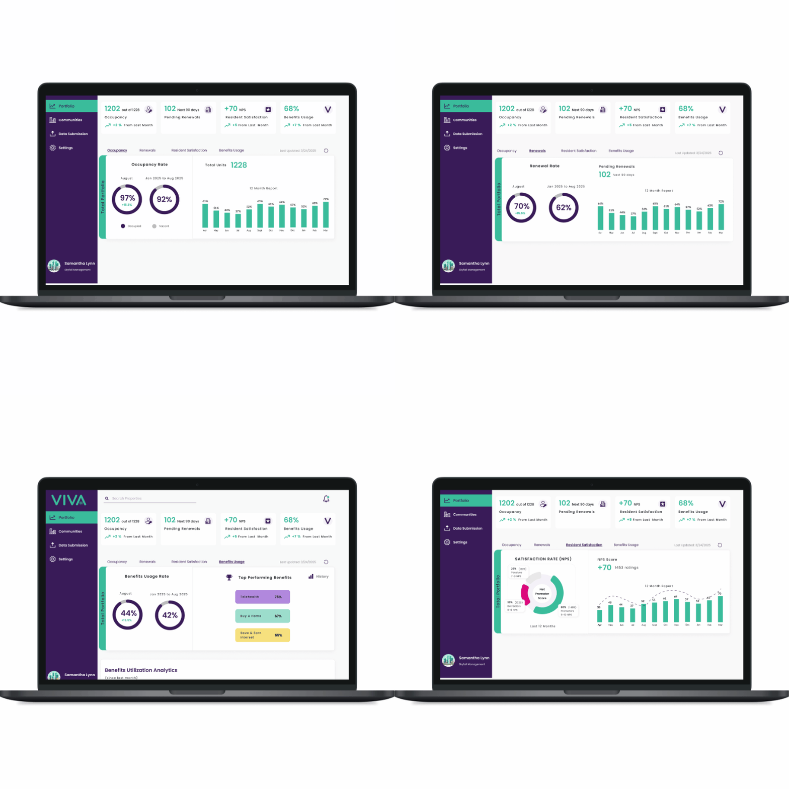
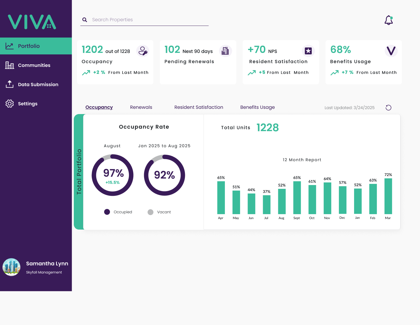
The Housing Partner Dashboard (HPD) is a secure, self-service platform designed for property owners, property managers, and Customer Success Managers (CSMs) to measure and monitor resident benefit programs across their communities.
It provides a centralized view of benefit adoption and usage, alongside key operational metrics such as occupancy and lease renewals, giving stakeholders the necessary context to evaluate performance at both the community and portfolio level.
The dashboard surfaces standardized metrics such as Benefit Usage Rate (based on occupied households) and the NPS Score, along with trends over time, plan-level insights, and resident-level breakdowns, enabling teams to compare performance across properties and identify patterns in adoption.
Initial Client Feedback
Before trends and the portfolio view were introduced, an October client walkthrough revealed several gaps in the existing HPD experience. The dashboard needed to evolve from simply displaying data to helping property teams navigate communities, manage residents, demonstrate engagement, and report impact.
1. Simplify Community Navigation
Clients wanted a clearer way to navigate community groups and landlord hierarchies.
Opportunity: Create a scalable tree structure that reflects how property organizations are structured.
2. Make Engagement More Visible
Clients emphasized that engagement metrics were critical for demonstrating program value and motivating landlord participation.
Opportunity: Make engagement metrics more prominent and provide context around what the numbers mean.
3. Connect Metrics to Impact
Clients wanted to demonstrate how benefits supported residents across health, education, and financial stability.
Opportunity: Connect product metrics to meaningful outcomes so stakeholders can communicate impact, not just activity.

The larger product challenge:
How might we transform HPD from a reporting dashboard into a decision-support tool that helps each stakeholder understand performance, identify opportunities, and take action?
First Redesign
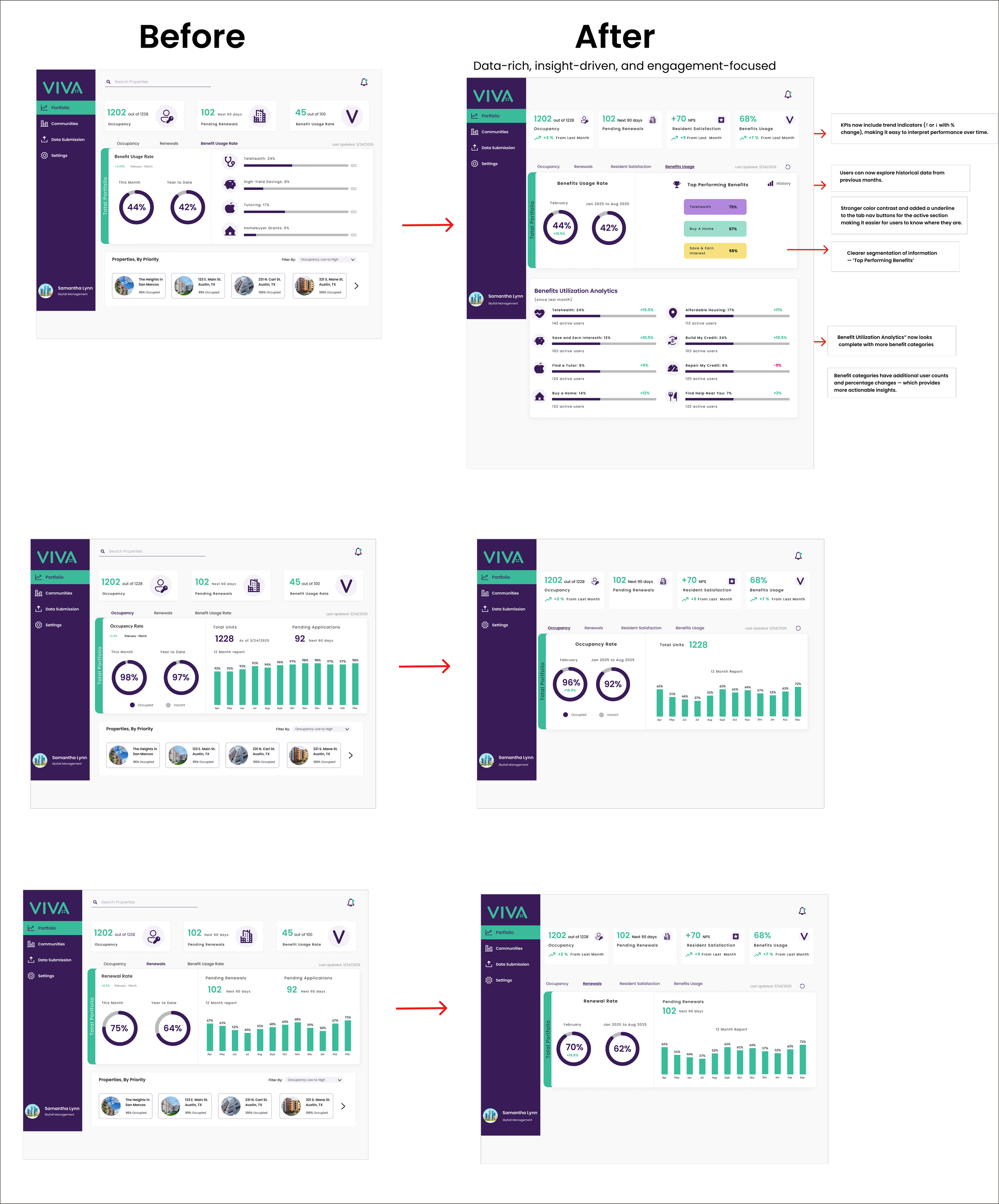
Based on the initial client feedback, I redesigned the HPD experience to improve data clarity, usability, and benefit visibility.
Key Improvements
Clearer Data & Performance
Reorganized KPIs with clearer labels, percentages, and performance indicators.
Made metrics such as benefit usage, occupancy, renewals, and resident satisfaction easier to scan.
Stronger Information Hierarchy
Introduced a Top Performing Benefits section.
Expanded benefit analytics to help users understand utilization and make faster decisions.
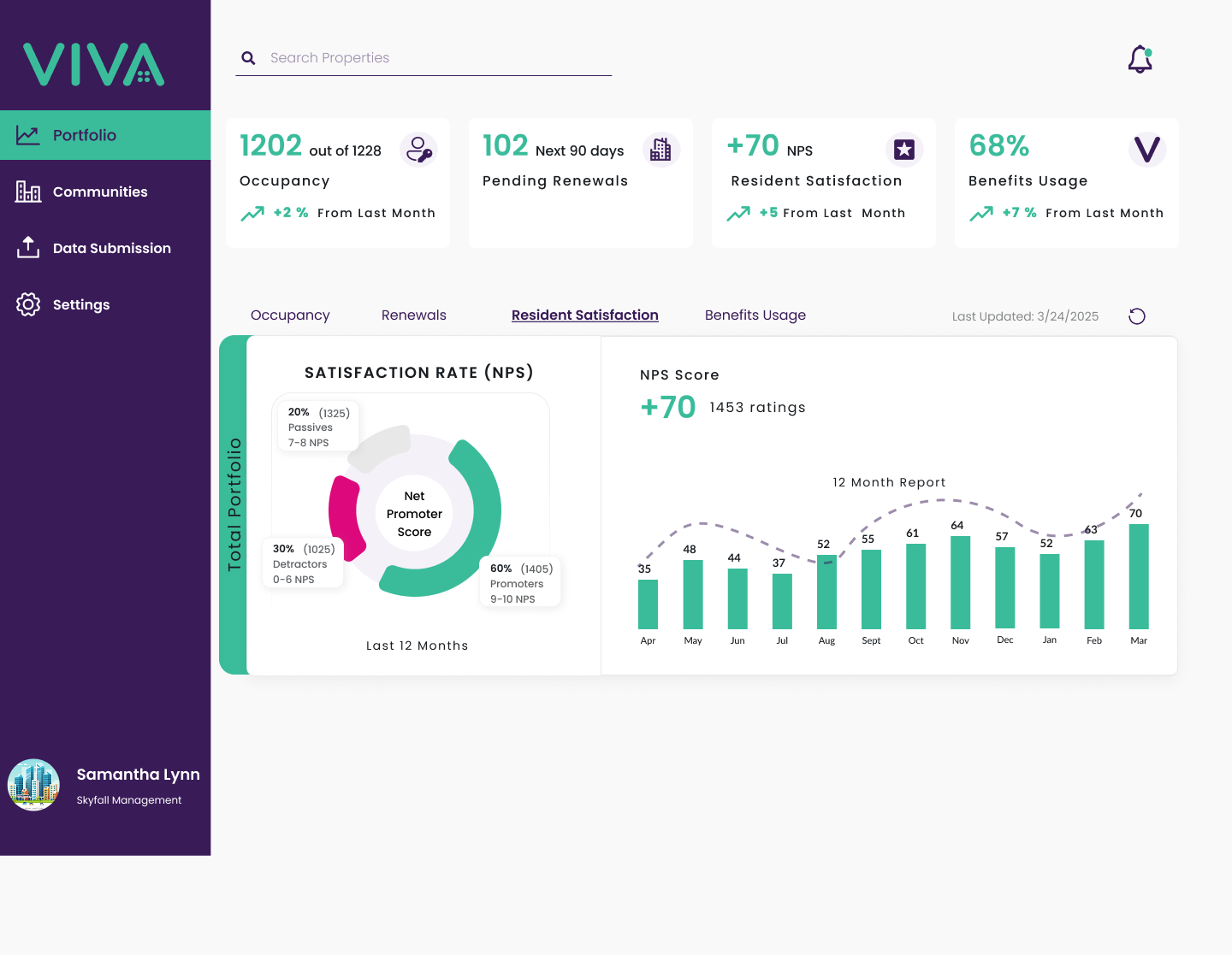
Resident Satisfaction
Incorporated resident satisfaction/NPS to give stakeholders visibility into how residents perceive their community and benefits experience.
Connected satisfaction with other engagement metrics to provide a more holistic view of community performance.
Stronger Visual Cues
Added trend arrows and performance indicators to communicate positive and negative changes at a glance.
Expanded Benefit Insights
Added additional benefit categories, including Build My Credit and Affordable Housing Search, to provide a more complete view of resident engagement.
Community-Level Insights
Added a dedicated Community page where users could explore benefits, engagement, and community-level information.
Consistent & Accessible UI
Refined spacing, typography, alignment, and layout consistency to create a cleaner and easier-to-scan experience.
Measuring Product Success
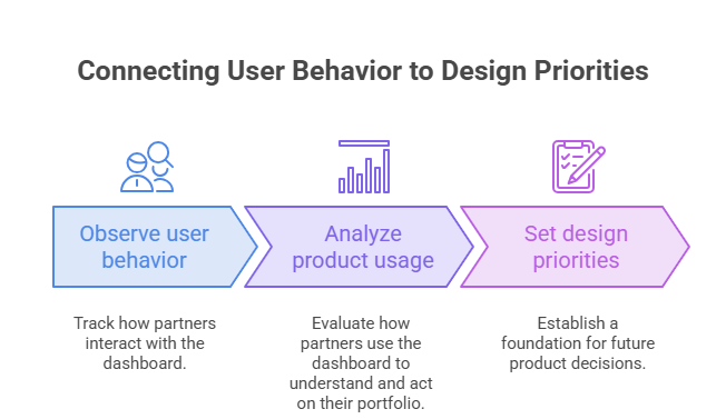
After the first redesign, I identified the need to establish a way to measure how partners were actually using HPD.
Rather than measuring success only through visual improvements, I defined a set of FullStory behavioral KPIs to understand adoption, engagement, insight consumption, and feature usage.
1. HPD Adoption
Are partners using HPD?
% of Owners Logging Into HPD — Last 30 Days
Monthly Active Owners
These metrics establish whether HPD is becoming part of partners' regular workflow.
2. Engagement
Are users exploring the dashboard or simply checking a metric and leaving?
Average Pages Viewed per Session
Average Session Duration
These help distinguish quick metric checks from deeper analysis.
3. Insight Consumption
Which information is most valuable to partners?
Track views of key areas:
Occupancy
Renewals
NPS / Resident Satisfaction
Benefits Usage
This helps identify which insights should receive greater emphasis in future iterations.
4. Community-Level Exploration
Are partners moving from portfolio-level information into individual communities?
Community Pages Viewed
This metric helps measure whether users are drilling down into property-level performance.
5. Feature Interaction
Are users actively analyzing the data?
Track interactions such as:
Portfolio search
Community table filters
Table sorting
Data exploration
User Research and UX Audit
The first redesign was not the end of the process. As HPD evolved, I continued reviewing user behavior and conducting user interviews to identify additional workflow and reporting challenges.
Research revealed a growing need for stakeholders to understand performance across communities, rather than viewing individual metrics in isolation.
This shifted the design question from:
“How can we make the dashboard clearer?”
to:
“How can we help stakeholders understand what is changing across their portfolio and where they should focus?”
To explore this further, I conducted a UX audit of the existing dashboard, looking beyond visual usability to identify gaps in historical context, trends, comparisons, data interpretation, and information hierarchy.
The audit helped translate these research insights into specific opportunities for the next iteration of HPD.
Challenges
The Historical Data Challenge
One of the biggest opportunities identified through research was historical trend analysis.
Users and stakeholders wanted to understand changes over time across metrics such as:
Occupancy
Renewals
Benefit utilization
Resident satisfaction
I worked with developers to explore whether historical data could be backfilled to support these experiences.
However, the team identified a major technical constraint.
Data Migration
HPD was undergoing a migration to a new data architecture.
Because historical information had not consistently been preserved in the existing system, the required back data could not be fully recovered and backfilled after migration.
Product Tradeoff
I worked with the Product Director to evaluate the trade-off between user expectations, data reliability, and the longer-term direction of the product.
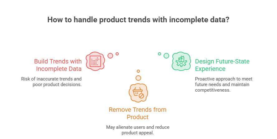
At the time, historical data was not yet reliable enough to support trends confidently. This created three possible approaches:
Build trends with incomplete data
vs.
Remove trends from the product
vs.
Design a future-state experience
I chose the third approach.
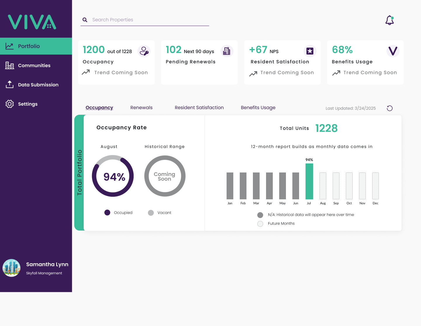
Rather than designing around today's data limitations, I designed a future-state experience that established how trends, historical context, and portfolio comparisons should work once the underlying data became reliable.
Designing for the Future State
Instead of presenting potentially misleading historical trends, I designed a future-state experience showing how HPD could support trend analysis once reliable historical data becomes available.
The concept explored:
Occupancy trends
Renewal trends
Benefit utilization trends
Resident satisfaction trends
Portfolio-level comparisons
Community performance changes
Year-over-year analysis
This allowed the team to establish a clear vision for the product without compromising the accuracy of the current experience.
Product & Engineering Collaboration
The project required continuous collaboration beyond the design team.
I worked with product and engineering to understand:
What data was available
How metrics were calculated
Which historical data could be recovered
What could realistically be implemented
Which experiences should be designed for the current state versus future state
This was particularly important for metrics such as occupancy and benefits usage, where the denominator and resident lifecycle could affect the accuracy of reporting.
Rather than treating engineering constraints as separate from UX, I incorporated them into the design process.
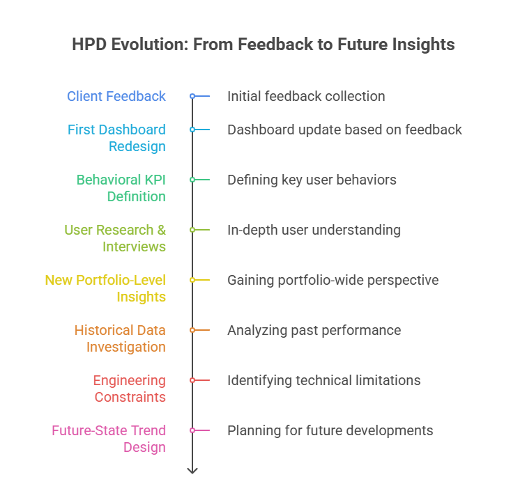
Each iteration was informed by a different source of evidence:
Stakeholder needs → User behavior → User research → Data reality → Product strategy
From Feedback to Product Decisions
Outcome
The project evolved HPD from a primarily reporting-oriented dashboard toward a more strategic analytics experience.
Key contributions
Redesigned dashboard information hierarchy
Improved KPI clarity and data visualization
Added benefit performance insights
Added resident satisfaction/NPS visibility
Introduced a dedicated Community experience
Defined FullStory KPIs for measuring adoption and engagement
Conducted ongoing user research and interviews
Identified the need for portfolio-level and trend-based analysis
Collaborated with engineering to investigate historical data availability
Designed a future-state trend experience despite historical data limitations
Balanced user needs, business goals, data accuracy, and technical feasibility
What's Next
HPD continues to evolve as we gather more user feedback, improve data availability, and validate new product opportunities.
The next iterations will focus on strengthening portfolio-level insights, historical trends, and actionable recommendations as the underlying data becomes available.
This case study is ongoing — more to come as the product evolves.